
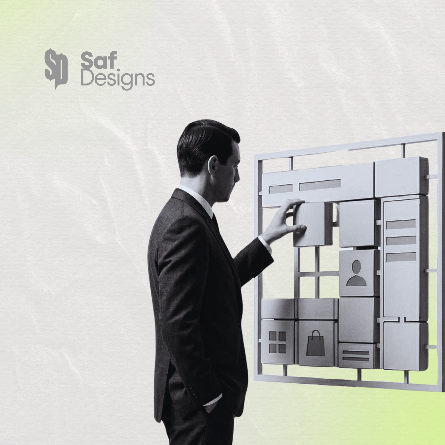
The Bento Grid Layout
Your brand design could be costing you revenue as your competitors invest in establishing themselves as the authority in your sector. Your brand must reflect authority, value and trust so that you set yourself above your competitors.
A simple 15-minute discovery call will confirm how we can assist your website or brand design, with a strategy to help you grow and thrive.
The Bento Grid Revolution: Why 2026 is the Year of the Modular Website
If you have looked at a new Apple product page or any high-end tech website recently, you have probably seen it.
The layout consists of neat, rounded rectangles of different sizes that fit together perfectly, like a Japanese lunch box. We call this the Bento Grid.
It has become the "must-have" design trend of 2026, and for good reason. As someone who spent years in construction project management, I have a natural affinity for this style because it is built on a foundation of perfect structure and order.
Why Everyone is Switching to Bento Layouts
For a long time, web design was stuck in a "row after row" format. It worked, but it could feel a bit repetitive and boring. The Bento Grid changes that.
It is incredible for Mobile Because the design is made of individual "tiles." Those tiles can easily stack and rearrange themselves when you move from a desktop to a phone. It makes for a seamless experience without losing the professional look.
It highlights what matters. The grid allows us to make the most important information bigger. We can put your main service in a large tile and your minor services in smaller ones. It guides the user’s eye exactly where you want it to go.
It looks premium. There is a reason the biggest brands in the world are moving this way. It feels organised, modern, and high-end. If you want to stand out from local competitors who are still using old, cluttered templates, this is the quickest way to do it.
Function Meets Form
At Saf-Designs, I don't just follow trends because they look pretty. I use them because they solve problems.
A Bento layout allows me to pack a lot of information into a small space without the website feeling "busy" or overwhelming. It’s about creating a visual hierarchy that makes sense.
If your current website feels like a wall of text or a disorganised mess, a move to a modular, Bento-style layout could be exactly what you need to refresh your brand and build trust with new clients.